
Appearance
VitePress 暗色主题适配实战:从白底漏光到全站统一

本文记录一次 VitePress 暗色主题适配 的完整实战过程。
我们基于 VitePress 搭建文档站,并使用自定义首页布局。切换到 暗色模式(dark mode) 后,页面出现白底漏光、组件颜色不跟随主题等问题。最终通过 isDark + provide/inject + CSS 变量 的组合方案,实现了 VitePress 全站统一的暗色主题适配。
文中包含问题定位思路、多种方案的对比取舍、3 个实际踩过的坑,以及完整的可复制代码。如果你正在给 VitePress 做主题定制,本文可以直接作为参考模板。
一、背景:为什么需要 VitePress 暗色主题适配
我们基于 VitePress 搭建了一套文档站,首页用了自定义布局(IndexProvider),包含三个核心组件:
HomeHero:顶部 Hero 区HomeStats:悬浮在 Hero 上的统计卡片InfoContainer:两组特性卡片
亮色模式下一切正常。但切换到暗色模式后,出现了一个尴尬的问题:
页面中间有一条白底,像漏光一样。
而且卡片、文字颜色完全不跟随主题切换。
二、问题定位:VitePress 首页白底漏光从哪来
2.1 现象
暗色模式下:
- Hero 区正常(本来就是蓝色背景)
- 但 Hero 下方出现一大片 白色区域
HomeStats卡片仍然是白底黑字InfoContainer的卡片也全是亮色样式
2.2 用 DevTools 定位白底来源
打开浏览器开发者工具,选中白色区域,查看 DOM 层级:
<body>
  <div id="app">
    <div class="Layout">
      <div class="VPHome">                     ← 白色背景来源
        <div class="VPHome">
          <section class="hero-container ...">
          <div class="bg-[#eef4fa]" style="height: 1200px">   ← Container
            <section class="stats-section ...">
            <section class="info-section ...">
          </div>
        </div>
      </div>
    </div>
  </div>
</body>关键发现:
- 白底来自 VitePress 的
.VPHome(默认--vp-c-bg是白色) Container里的height: 1200px是固定高度,内容没填满时下方会露出父级白底HomeStats/InfoContainer的卡片是硬编码的bg-white,不跟随主题
核心结论:问题不在单个组件,而是整条渲染链路都没有响应暗色状态。
三、方案设计:isDark + CSS 变量的整体思路
3.1 整体链路
VitePress isDark(响应式)
       │
       ▼
IndexProvider provide('isDark')
       │
       ├──▶ HomeStats    inject → is-dark class
       ├──▶ InfoContainer inject → is-dark class
       └──▶ Container     inject → is-dark class
                                    │
                                    ▼
CSS 变量在 .is-dark 下重定义三层机制:
| 层 | 职责 |
|---|---|
| VitePress | 提供响应式 isDark |
| 组件树 | 通过 provide/inject 传递 |
| 样式 | 用 CSS 变量 + .is-dark 选择器切换 |
3.2 为什么选 CSS 变量而不是 Tailwind dark:
| 方案 | 优点 | 缺点 |
|---|---|---|
Tailwind dark: | 写法短 | 渐变文字、阴影、hover 表达力有限 |
| CSS 变量 ✅ | 集中管理、支持复杂样式、过渡平滑 | 需要多写一层变量 |
isDark ? A : B 三元 | 直观 | 属性一多就乱,维护性差 |
最终选 CSS 变量,因为首页涉及渐变文字、卡片阴影、hover 高亮等复杂样式。
四、实现:VitePress 暗色主题适配的三个组件
4.1 第一版:手写 MutationObserver(不推荐)
最初尝试手动监听 <html> 的 class 变化:
ts
const isDark = ref(false)

const checkDarkMode = () => {
  isDark.value = document.documentElement.classList.contains('dark')
}

const observer = new MutationObserver(checkDarkMode)

onMounted(() => {
  checkDarkMode()
  observer.observe(document.documentElement, {
    attributes: true,
    attributeFilter: ['class']
  })
})

provide('isDark', toRef(isDark))问题:
- 重复造轮子:VitePress 内部已经有响应式
isDark - SSR 隐患:
document在 Node 端不存在 - 生命周期管理麻烦:
observer.disconnect()容易遗漏
4.2 最终版:使用 VitePress 原生 isDark
ts
import { useData } from 'vitepress'

const { isDark } = useData()   // Ref<boolean>,自动响应
provide('isDark', isDark)优势:
- ✅ 和 VitePress 内部状态完全同步
- ✅ SSR 安全
- ✅ 无需手动监听/清理
- ✅ 代码从 20 行降到 2 行
4.3 Container:页面大底容器
改造前:
vue
<template>
  <div :style="{ height: '1200px' }" class="bg-[#eef4fa]">
    <slot />
  </div>
</template>改造后:
vue
<script lang="ts" setup>
import { computed, inject, ref, type Ref } from 'vue'

const props = withDefaults(
  defineProps<{ height?: number | string }>(),
  { height: 800 }
)

// 用 minHeight 替代 height,避免固定高度露白
const heightStyle = computed(() => ({
  minHeight: typeof props.height === 'number' ? `${props.height}px` : props.height,
}))

const isDark = inject<Ref<boolean>>('isDark', ref(false))
</script>

<template>
  <div
    class="theme-container"
    :class="{ 'is-dark': isDark }"
    :style="heightStyle"
  >
    <slot />
  </div>
</template>

<style scoped>
.theme-container {
  width: 100%;
  background: #eef4fa;
  transition: background-color 0.3s ease;
}

.theme-container.is-dark {
  background: #0f172a;
}
</style>两个关键改动:
height→minHeight:内容不足时不再留白- 背景色跟随
isDark:盖住上层.VPHome的白底
4.4 HomeStats:统计卡片
vue
<script lang="ts" setup>
import { inject, ref, type Ref } from 'vue';

const isDark = inject<Ref<boolean>>('isDark', ref(false));

const stats = [
  {
    title: '50+',
    desc: '深度技术文章与实战教程',
  },
  {
    title: '10年',
    desc: '一线开发与架构经验沉淀',
  },
  {
    title: '99.9%',
    desc: '读者反馈的实用性与好评率',
  },
  {
    title: '3万+',
    desc: '月度访问与订阅读者',
  },
];
</script>

<template>
  <section
    class="stats-section flex justify-center gap-8 rounded-2xl max-w-6xl mx-auto -mt-32 py-16 px-5 relative z-10 flex-wrap"
    :class="{ 'is-dark': isDark }"
  >
    <div v-for="(stat, i) in stats" :key="i" class="flex-1 min-w-[160px] text-center mb-4 sm:mb-0">
      <div class="stats-title text-2xl font-bold mb-1">{{ stat.title }}</div>
      <div class="stats-desc text-base opacity-90">{{ stat.desc }}</div>
    </div>
  </section>
</template>

<style scoped>
/* 亮色 */
.stats-section {
  --hs-bg: #ffffff;
  --hs-title: #111827;
  --hs-desc: #333333;
  --hs-shadow: 0 6px 40px rgba(30, 60, 170, 0.07);

  background: var(--hs-bg);
  box-shadow: var(--hs-shadow);
  transition: background-color 0.3s, box-shadow 0.3s;
}

/* 暗色 */
.stats-section.is-dark {
  --hs-bg: #1e293b;
  --hs-title: #f1f5f9;
  --hs-desc: #cbd5e1;
  --hs-shadow: 0 6px 40px rgba(0, 0, 0, 0.5);
}

.stats-title { color: var(--hs-title); }
.stats-desc  { color: var(--hs-desc); }
</style>技巧:把 --hs-* 变量定义在根元素上,.is-dark 时整体覆盖,子元素只引用变量,不用写任何条件样式。
4.5 InfoContainer:渐变标题与卡片
vue
<script lang="ts" setup>
import { Feature } from '../types/feature';
import { computed, inject, ref, type Ref } from 'vue';
import { VPLink, VPImage } from 'vitepress/theme';

// 组件属性声明
const props = withDefaults(
  defineProps<{ title: string; subtitle?: string; cols?: number; data: Feature[] }>(),
  { cols: 3 },
);

const gridClass = computed(() => {
  return ['grid', `grid-cols-${props.cols}`, `md:grid-cols-${props.cols}`, 'gap-6'];
});

// 从父组件注入暗色状态
const isDark = inject<Ref<boolean>>('isDark', ref(false));
</script>

<template>
  <section
    class="info-section py-16"
    :class="{ 'is-dark': isDark }"
  >
    <div class="max-w-6xl mx-auto text-center">
      <h2 class="info-title text-3xl md:text-4xl font-bold mb-4">
        {{ title }}
      </h2>

      <div v-if="subtitle" class="info-subtitle mb-12">
        {{ subtitle }}
      </div>

      <slot name="extra"></slot>

      <div :class="gridClass">
        <template v-for="(item, idx) in data" :key="idx">
          <div
            class="info-card w-full rounded-xl p-6 text-left min-w-[290px]"
            :class="{ 'is-link': item.link }"
          >
            <template v-if="item.link">
              <VPLink :href="item.link">
                <div class="info-card-title font-bold text-2xl mb-6 flex flex-row">
                  <div class="flex-initial rounded-full h-6 w-6 mr-4" v-if="item.icon">
                    <VPImage :image="item.icon" />
                  </div>
                  <div class="flex-initial">{{ item.title }}</div>
                </div>
                <div class="info-card-body text-base leading-relaxed h-52" v-html="item.details"></div>
              </VPLink>
            </template>
            <template v-else>
              <div class="info-card-title font-bold text-2xl mb-6">{{ item.title }}</div>
              <div class="info-card-body text-base leading-relaxed" v-html="item.details"></div>
            </template>
          </div>
        </template>
      </div>
    </div>
  </section>
</template>

<style scoped>
/* 亮色 */
.info-section {
  --ic-bg: #eef4fa;
  --ic-title-from: #2563eb;
  --ic-title-to: #10b981;
  --ic-subtitle: #6b7280;
  --ic-card-bg: #ffffff;
  --ic-card-border: #ffffff;
  --ic-card-shadow: 0 6px 32px rgba(30, 60, 170, 0.08);
  --ic-card-title: #111827;
  --ic-card-body: #374151;

  background: var(--ic-bg);
  transition: background-color 0.3s ease;
}

/* 暗色 */
.info-section.is-dark {
  --ic-bg: #0f172a;
  --ic-title-from: #60a5fa;
  --ic-title-to: #34d399;
  --ic-subtitle: #94a3b8;
  --ic-card-bg: #1e293b;
  --ic-card-border: #334155;
  --ic-card-shadow: 0 6px 32px rgba(0, 0, 0, 0.4);
  --ic-card-title: #f1f5f9;
  --ic-card-body: #cbd5e1;
}

.info-title {
  background: linear-gradient(to right, var(--ic-title-from), var(--ic-title-to));
  -webkit-background-clip: text;
  background-clip: text;
  color: transparent;
}

.info-subtitle {
  color: var(--ic-subtitle);
}

.info-card {
  background: var(--ic-card-bg);
  border: 1px solid var(--ic-card-border);
  box-shadow: var(--ic-card-shadow);
  transition: background-color 0.3s, border-color 0.3s, box-shadow 0.3s;
}

.info-card-title {
  color: var(--ic-card-title);
}

.info-card-body {
  color: var(--ic-card-body);
}

.info-card.is-link:hover {
  border-color: #4f46e5;
  cursor: pointer;
  box-shadow: 0 20px 25px -5px rgba(0, 0, 0, 0.15);
}
</style>要点:
- 渐变颜色走 CSS 变量,暗色下自动变亮一档
bg-gradient-to-r from-blue-600 to-emerald-500这类 Tailwind 类不能跟随isDark动态切换,必须移到 CSS
五、VitePress 暗色主题适配的 3 个常见坑
坑 1:useVitePressTheme 的 SSR 陷阱
曾试图封装一个读取 CSS 变量的 composable:
ts
// ❌ 有 SSR 崩溃风险
brand: computed(() =>
  getComputedStyle(document.documentElement)
    .getPropertyValue('--vp-c-brand').trim()
)两个问题:
- SSR 阶段
document未定义 → 构建崩溃 getComputedStyle不是响应式依赖 →isDark变化后不重新求值
结论:能用 CSS 变量直接用,别用 JS 读。真要读,必须 onMounted + watch(isDark)。
坑 2:height 固定值会露白
Container :height="1200" 用的是 height,内容不满时下方留白,露出父级白底。改成 min-height 就解决了。
坑 3:Tailwind 动态类名会被 purge
ts
`grid-cols-${props.cols}` // ❌ 可能被 Tailwind 树摇掉Tailwind 编译时扫描源码里的完整类名,动态拼接的会被清理。解决方式:
- 用映射表写死
- 或
tailwind.config里加safelist
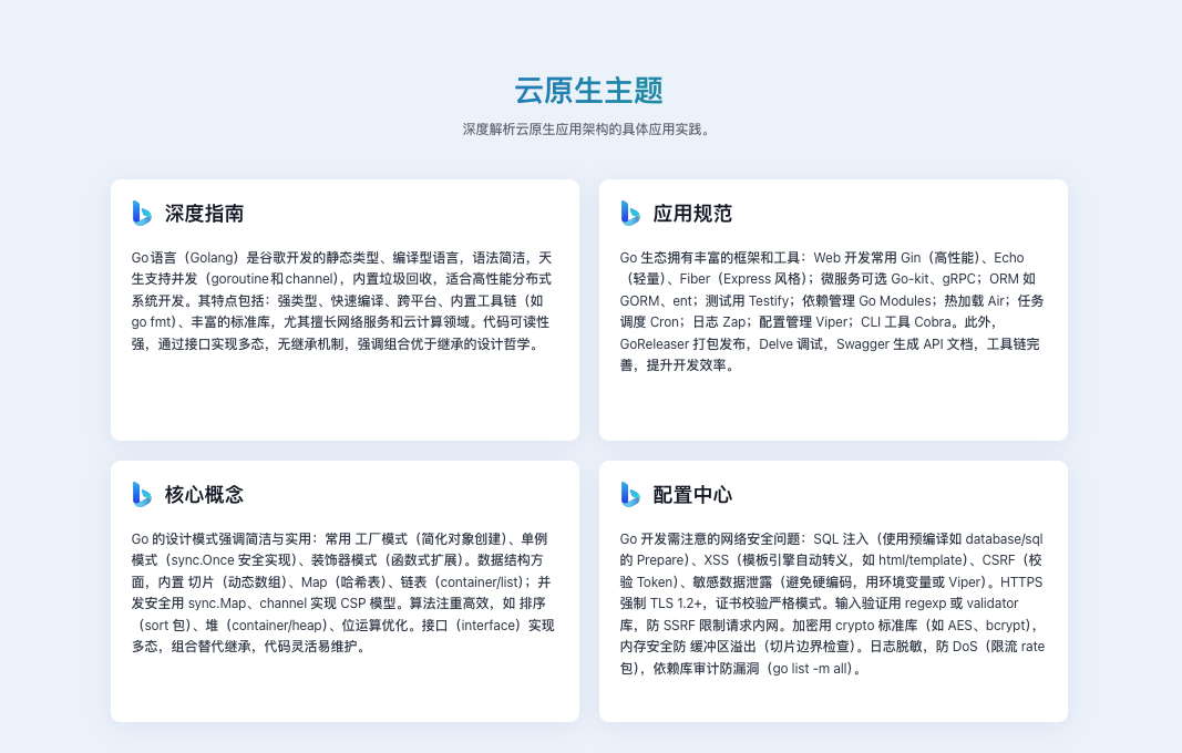
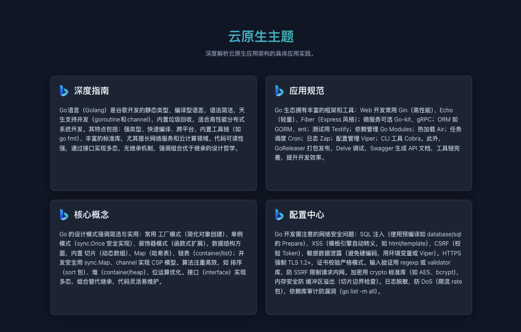
六、最终效果对比
| 区域 | 亮色 | 暗色 |
|---|---|---|
| 页面底 | #eef4fa | #0f172a |
| 卡片底 | #ffffff | #1e293b |
| 卡片边框 | #ffffff | #334155 |
| 标题渐变 | #2563eb → #10b981 | #60a5fa → #34d399 |
| 正文 | #374151 | #cbd5e1 |
| 阴影 | rgba(30,60,170,0.08) | rgba(0,0,0,0.4) |
全站统一过渡 0.3s,切换无闪烁。
七、总结:VitePress 暗色主题适配的核心经验
- 优先用框架原生能力:VitePress 有
isDark,不要手写MutationObserver - CSS 变量 > 条件类:颜色集中管理,组件内只引用变量
- SSR 阶段禁止访问
document height用min-height:内容自适应更稳
未来优化方向
- 抽全局变量:多个组件都做暗色后,
--ic-*/--hs-*有大量重复,可以抽到:root/.dark,甚至不需要provide/inject HomeHero暗色适配:目前 Hero 仍是固定蓝色,可纳入同一套体系- 封装主题 hook:如果要给多个页面用,可以封装
useTheme()统一管理
一句话原则
能交给 CSS 的,不要交给 JS;能交给框架的,不要自己造。
常见问题(FAQ)
VitePress 如何监听暗色模式切换?
直接使用 VitePress 提供的 useData().isDark,它是响应式 Ref<boolean>,会自动跟随主题切换,无需手写 MutationObserver。
ts
import { useData } from 'vitepress'
const { isDark } = useData()
VitePress 暗色模式下组件颜色不生效怎么办?
两个最常见原因:
- 使用了 Tailwind 的
bg-white等硬编码类名,不会跟随主题; - 使用了
dark:变体但项目未配置darkMode: 'class'。
推荐做法:把颜色抽成 CSS 变量,在 .is-dark 或 .dark 选择器下整体重定义,组件只引用变量。
VitePress 的 .dark 类和 isDark 有什么区别?
.dark是 VitePress 挂在<html>上的CSS 类,用于纯样式切换;isDark是useData()暴露的响应式状态,用于 JS 逻辑判断。
两者始终同步。只在样式层做适配时,用 .dark 就够;需要 JS 逻辑时,用 isDark。
VitePress 暗色主题适配需要引入额外依赖吗?
不需要。useData()、provide/inject、CSS 变量都是 VitePress 与 Vue 内置能力。本文方案零依赖。
附:完整代码结构
docs/.vitepress/theme/
├── components/
│   ├── Container.vue        # 页面大底容器
│   ├── HomeStats.vue        # 统计卡片
│   └── InfoContainer.vue    # 特性卡片
└── layouts/
    └── provider/
        └── IndexProvider/
            └── index.vue    # 首页入口,provide isDark