
English
Tailwind CSS Gradient Text Effects: From bg-clip-text to Component-Based Practice
Are you tired of cookie-cutter solid-color headings? Want to make the heading in your blog’s Hero section more eye-catching, without introducing heavy image or Canvas libraries?
Today, I will share a lightweight, pure CSS solution—Use Tailwind CSS to add a colorful, glowing gradient effect to text. This is not merely a code implementation, but a complete technical exploration from “discovering the problem” to “elegant delivery.”
Final effect preview
First, let's look at the goal we want to achieve: the title text should have a smooth, vibrant gradient, while the background stays clean and tidy.

Stop 1: First Experience — Simple Linear Gradient
It all starts with the simplest idea: add a gradient background to the title.
vue
<template>
  <h1 class="bg-gradient-to-r from-rose-400 to-orange-500">
    Fishfinal's Blog
  </h1>
</template>
However, there is always a gap between reality and ideals. You will find that gradient colors Applies to the entire element box, rather than the text itself. This is obviously not the effect we want.
Stop 2: Core Technique — Make the Gradient "Stick" to the Text
The key to the problem is: we need to make the text become transparent, then Reveal the gradient background behind.
Tailwind CSS provides two key utility classes that perfectly solve this problem:
bg-clip-text: Make the background appear only in the text-clipped area.text-transparent: Make the text itself transparent.
Combine these two classes with the gradient:
vue
<template>
  <h1 class="bg-gradient-to-r from-pink-500 via-red-500 to-yellow-500 bg-clip-text text-transparent">
    Fishfinal's Blog
  </h1>
</template>
Bingo! The gradient effect magically "sticks" to the text—this is the core effect we want.
Stop 3: Pitfall Log — When the Effect Is “Incomplete”
Do you think this is perfect? In practical applications, I found a problem: under certain background images or complex layouts, the text effect looks Not "solid" enough, I always feel it's a bit thin.
Problem Analysis: When the text is completely transparent, it relies entirely on the gradient background behind it. If the background color is too light or the environment is complex, the edges of the text and its overall presence will become weaker.
Solution: Add an ultra-thin text shadow to the text to enhance its outline while not affecting the gradient effect.
vue
<template>
  <h1 class="bg-gradient-to-r from-pink-500 via-red-500 to-yellow-500 bg-clip-text text-transparent drop-shadow-sm">
    Fishfinal's Blog
  </h1>
</template>
drop-shadow-sm The class adds a subtle shadow to the text, improving readability while preserving the purity of the gradient effect. A small detail makes a big difference.
Station Four: Elegant Implementation — Componentization and Color Reference
In a Vue project, we should encapsulate this part of the logic into a Reusable components, and allow the gradient color scheme to be dynamically specified from an external source.
1. Encapsulated HomeHero.vue component
vue
<script lang="ts" setup>
defineProps<{
  title: string
  subtitle?: string
  description?: string
  gradientClass?: string  // Supports dynamically passing in gradient schemes
}>();

// Predefine some curated color schemes (inspiration: Hypercolor)
const presetGradients = {
  hyper: 'from-pink-500 via-red-500 to-yellow-500',
  sunset: 'from-orange-400 to-rose-600',
  flamingo: 'from-pink-400 to-rose-500',
  hawaii: 'from-emerald-400 to-cyan-500',
  burningSunrise: 'from-amber-500 via-red-500 to-rose-600',
}
</script>

<template>
  <section class="hero-container ...">
    <div class="max-w-4xl mx-auto text-center">
      <h1 class="relative">
        <span
          :class="[
            'relative z-10 bg-clip-text text-transparent drop-shadow-sm',
            gradientClass || 'bg-gradient-to-r from-pink-500 via-red-500 to-yellow-500'
          ]"
        >
          {{ title }}
        </span>
      </h1>
      <!-- The subtitle and description sections remain unchanged -->
    </div>
  </section>
</template>
2. How to use
vue
<!-- Use the default Hyper gradient -->
<HomeHero title="Endless Fish Tail's Blog" />

<!-- Use Hawaii gradient -->
<HomeHero
  Tech Column
  gradientClass="bg-gradient-to-r from-emerald-400 to-cyan-500"
/>
3. Color scheme reference: Hypercolor
If you're not confident about color matching, I highly recommend a hidden-gem website:Hypercolor.dev.
It collects a large number of beautiful Tailwind CSS gradient combinations and supports one-click copying of class names.
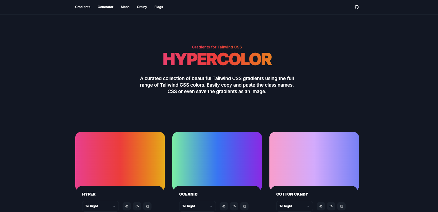
A few color schemes I really like:
| Color scheme name | Tailwind class names | Visual effects |
|---|---|---|
| Hyper | from-pink-500 via-red-500 to-yellow-500 | Lively and colorful |
| Sunset | from-orange-400 to-rose-600 | Warm sunset |
| Flamingo | from-pink-400 to-rose-500 | Passionate Flamingo |
| Oahu | from-blue-400 to-emerald-400 | Fresh Island |
| Burning Sunrise | from-amber-500 via-red-500 to-rose-600 | Blazing Dawn |
Summary and Expansion
Core Technology Review
Gradient background: Use
bg-gradient-to-{方向}andfrom-{颜色},to-{颜色}Define gradient.Text cropping:
bg-clip-text+text-transparentMake the text reveal the background gradient.Visual enhancement:
drop-shadow-{大小}Add text shadow to improve readability.Component encapsulation: Through
propsMake the gradient scheme configurable to improve reusability.
Extended Thinking
This technique is not limited to titles; you can also apply it to:
Button: Make the button text have a gradient effect on hover.
icon Fill the SVG icon with a gradient color.
special emphasis word: Use a gradient when highlighting keywords in a paragraph.
Navigation links: The currently active link uses a gradient underline.
Performance and accessibility reminder
performance: Pure CSS implementation, no additional network requests, excellent performance.
Accessibility: Ensure sufficient color contrast between the text and the background. If the gradient color is too light, it is recommended to also retain
drop-shadowEnhance contours.
Conclusion: From the most basic gradient background, to bg-clip-text the core principles, and then to elegant componentized encapsulation—we have achieved a professional gradient text effect step by step.
I hope this article can help your project say goodbye to blandness and take on new vitality.